Carregar apresentação
A apresentação está carregando. Por favor, espere

1
A natureza da linguagem visual
definir o que é uma imagem : Algo que pode ser percebido por meio da visão, ou algo que causa experiência visual. A imagem como centro da atenção artística desde o surgimento do homem como ser simbólico ate hoje, passando pelo advento da fotografia, depois do qual a arte vai transfere o seu interesse para fora da construção imagética e do objeto artístico em geral, dando mais ênfase no pensar não-convencional e na idéia artística. A pratica de arte abre se para novas experiências estéticas que não se restringem no campo da visão. Contudo nesta aula se encontram relacionadas uma serie de questões inerentes a construção de imagens.!!! Analisar e questionar as imagem artística como produção individual, como as obras de outros artistas, ajuda aos alunos de arte a compreender as idéias e os sentimentos expressos na produção de artistas de países, épocas e culturas diferentes. A valorização estética nas artes visuais envolve compreensão da intenção, do objetivo e da proficiência técnica num trabalho de arte. Construir sentidos nas arte visuais significa entender como os artistas atingem seus objetivos. É importante que os alunos desde a primeira série buscam compreender os valores estéticos – discutir a arte, procurando vocabulário para falar sobre as experiências estéticas. A arte ajuda a entender e interpretar o passado, questionar o presente e vislumbrar o futuro, elevar o espirito humano e libertar as paixões. Alunos e pessoas, que não conhecem as grandes obras de arte ou não dispões de vocabulário para analisá-las, constatam seus limites criativos. Conhecer os depoimentos dos artistas e as opiniões dos críticos de arte é fundamental na elaboração de um discurso estéticos. grafico/Docs/compvisual/gestalt.html GESTALT: German word meaning "configuration," "figure," or any whole pattern with characteristics different from its parts. E.g., the tune of a song is such a pattern because it does not appear in the individual notes. Similarly, a sentence's meaning does not inhere in the individual words themselves but in the relations between those words. GESTALT FACTORS: Conditions which create the perceived effect of a unitary figure (closure) rather than a relation of parts. The most frequently mentioned are contiguity, contrast, proximity, and similarity. For example, eight vertical lines will read as four bars if they are arranged in pairs rather than evenly spaced. In graphic design, it is very important to know gestalt theory because it allows us to predict how viewers respond to design. It does not only assure that our intention will be understood correctly by the viewers, but it also helps us to create a dynamic design. Gestalt is the German word for "form," and as it applied in gestalt psychology it means "unified whole" or " configuration." The essential point of gestalt is that in perception the whole is different from the sum of its parts. Gestalt psychologists developed five laws that govern human perception: Malevich Arte Computacional /2015 Prof ª. Nikoleta Kerinska Curso de Artes Visuais – IARTE – UFU
 rather than a relation of parts. The most frequently mentioned are contiguity, contrast, proximity, and similarity. For example, eight vertical lines will read as four bars if they are arranged in pairs rather than evenly spaced. In graphic design, it is very important to know gestalt theory because it allows us to predict how viewers respond to design. It does not only assure that our intention will be understood correctly by the viewers, but it also helps us to create a dynamic design. Gestalt is the German word for form, and as it applied in gestalt psychology it means unified whole or configuration. The essential point of gestalt is that in perception the whole is different from the sum of its parts. Gestalt psychologists developed five laws that govern human perception: Malevich Arte Computacional - 02/2015 Prof ª. Nikoleta Kerinska Curso de Artes Visuais – IARTE – UFU.")
2
Síntese da informação que possibilita uma análise estética
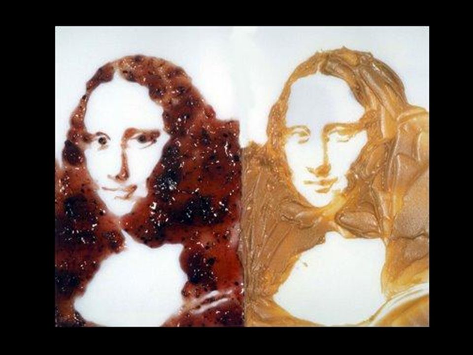
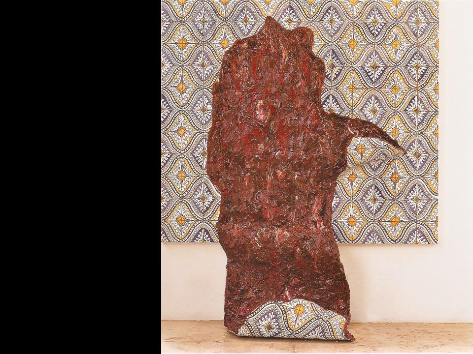
Elementos referentes a linguagem visual elementos a partir dos quais é construído o conteúdo de uma imagem artística Meios e técnicas de expressão relacionados aos processos de produção artística (suportes e materiais) Contexto histórico-cultural ajuda na compreensão de um trabalho de arte analisando em aspectos históricos as peculiaridades sociais, políticas e culturais relacionados a produção artística Elementos referentes a linguagem visual, também podemos chamá-la de um olhar artístico, este é referente a um vocabulário que contempla serie de conceitos a partir dos quais se constrói uma imagem de arte. Temos como exemplos a linha, a cor, os valores tonais, a forma, a textura, a representação do espaço, o contraste, a repetição dos elementos, a composição, etc. tudo que nos possibilita descrever os elementos que compõem uma imagem . O segundo componente chamado por mim de meios e técnicas de expressão é relaciono com os meios e os processos de criação. Que tipo de matérias serão usados para construir a nossa imagem e como. A variedade de meios é muito grande e cada meios traz a sua expressividade peculiar: tempera, tinta óleo, aquarela, pastel, carvão, serigrafia As superfícies e as ferramentas a serem usadas representam uma variedade quase imensurável como exepmplo posso dar os desenho de VIK MUNITZ feitos com temperos e fotografados, ou os artistas que trabalham com pintura matérica. Os trabalhos da Adriana Varejão por ex. A arte contemporânea é marcada pelo hibridismo dos meios e das técnicas na construção de imagens artísticas. O componente histórico cultural aborda a compreensão de uma imagem em termos de contexto, perceptivas históricas e objetivos estéticos. O período histórico de qual data certo trabalho de arte é notado imediatamente por um artistas ou um admirador da arte. Arte Egípcia, Arte Africana, Arte da Antiguidade Clássica, arte romana, medieval, renascentistas, barroca, etc. cada imagem artística conduz os pensamentos da humanidade e a sua forma de se posicionar no mundo neste período. A partir desses três componentes podemos pensar numa apreciação estética de uma imagem esta obviamente não é algo tão simples igual definir as técnicas ou o período de criação referentes a uma imagem. Surgi ai a questão do gosto e da interpretação de uma imagem, que é feita por um percurso pela subjetividade (rede de interpretações subjetiva). Muitas vezes adoramos certas imagens ou não gostamos de outras sem para isso termos uma razão especifica. Identificação com um trabalho de arte é totalmente individual e isso faz da arte uma das experiências mais misteriosas. O conceito do gosto foi abordado por vários filósofos . GOSTO = critério ou cânone para julgar os objetos do sentimento. Kant “Critica do Juízo”, David Hume “Ensaios morais e políticos”.
 Contexto histórico-cultural ajuda na compreensão de um trabalho de arte analisando em aspectos históricos as peculiaridades sociais, políticas e culturais relacionados a produção artística. Elementos referentes a linguagem visual, também podemos chamá-la de um olhar artístico, este é referente a um vocabulário que contempla serie de conceitos a partir dos quais se constrói uma imagem de arte. Temos como exemplos a linha, a cor, os valores tonais, a forma, a textura, a representação do espaço, o contraste, a repetição dos elementos, a composição, etc. tudo que nos possibilita descrever os elementos que compõem uma imagem . O segundo componente chamado por mim de meios e técnicas de expressão é relaciono com os meios e os processos de criação. Que tipo de matérias serão usados para construir a nossa imagem e como. A variedade de meios é muito grande e cada meios traz a sua expressividade peculiar: tempera, tinta óleo, aquarela, pastel, carvão, serigrafia As superfícies e as ferramentas a serem usadas representam uma variedade quase imensurável como exepmplo posso dar os desenho de VIK MUNITZ feitos com temperos e fotografados, ou os artistas que trabalham com pintura matérica. Os trabalhos da Adriana Varejão por ex. A arte contemporânea é marcada pelo hibridismo dos meios e das técnicas na construção de imagens artísticas. O componente histórico cultural aborda a compreensão de uma imagem em termos de contexto, perceptivas históricas e objetivos estéticos. O período histórico de qual data certo trabalho de arte é notado imediatamente por um artistas ou um admirador da arte. Arte Egípcia, Arte Africana, Arte da Antiguidade Clássica, arte romana, medieval, renascentistas, barroca, etc. cada imagem artística conduz os pensamentos da humanidade e a sua forma de se posicionar no mundo neste período. A partir desses três componentes podemos pensar numa apreciação estética de uma imagem esta obviamente não é algo tão simples igual definir as técnicas ou o período de criação referentes a uma imagem. Surgi ai a questão do gosto e da interpretação de uma imagem, que é feita por um percurso pela subjetividade (rede de interpretações subjetiva). Muitas vezes adoramos certas imagens ou não gostamos de outras sem para isso termos uma razão especifica. Identificação com um trabalho de arte é totalmente individual e isso faz da arte uma das experiências mais misteriosas. O conceito do gosto foi abordado por vários filósofos . GOSTO = critério ou cânone para julgar os objetos do sentimento. Kant Critica do Juízo , David Hume Ensaios morais e políticos .")
5
O GOSTO => critério ou cânone para julgar os objetos do sentimento
O GOSTO => critério ou cânone para julgar os objetos do sentimento. Kant “Critica do Juízo”, David Hume “Ensaios morais e políticos”.

6
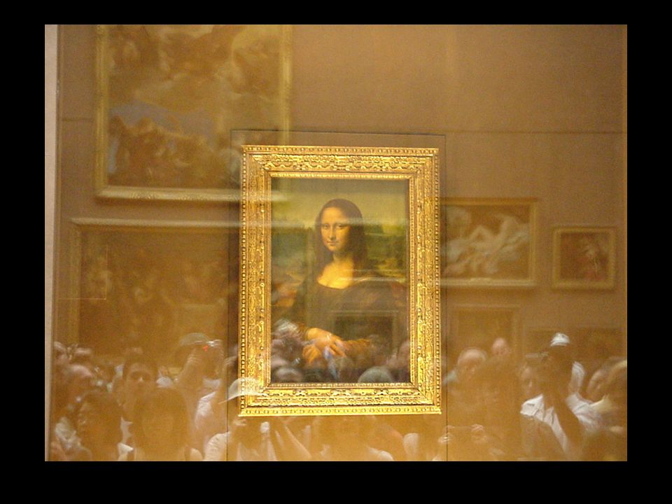
Mona Lisa Leonardo da Vinci c (77x53 cm.) Óleo sobre madeira
 Óleo sobre madeira")
8
Conceito de Diagramação:
O termo diagramação vem da palavra diagrama (em latim Diagramma), que significa desenho geométrico usado para demonstrar algum problema, resolver alguma questão ou representar graficamente a lei de variação de um fenômeno. Conceito de Diagramação:O termo diagramação vem da palavra diagrama (em latim Diagramma), que significa desenho geométrico usado para demonstrar algum problema, resolver alguma questão ou representar graficamente a lei de variação de um fenômeno.
, que significa desenho geométrico usado para demonstrar algum problema, resolver alguma questão ou representar graficamente a lei de variação de um fenômeno. Conceito de Diagramação:O termo diagramação vem da palavra diagrama (em latim Diagramma), que significa desenho geométrico usado para demonstrar algum problema, resolver alguma questão ou representar graficamente a lei de variação de um fenômeno.")
9
Como termo aplicado ao estudo da linguagem visual Diagramar significa distribuir adequadamente os elementos visuais dentro de um formato. Elementos visuais: texto, títulos, fotos, ilustrações, desenhos, símbolos, espaços, etc. Como termo aplicado ao estudo da linguagem visual Diagramar significa distribuir adequadamente os elementos visuais dentro de um formato. Elementos visuais: texto, títulos, fotos, ilustrações, desenhos, símbolos, espaços, etc.

10
Diagramar = Compor elaborar uma composição

11
Composição = O conceito principal na criação de uma
Composição = O conceito principal na criação de uma imagem/mensagem visual Conhecer as propriedades do formato para organizar de maneira melhor os elementos visuais. Composição = O conceito principal na criação de uma imagem mensagem visual Diretamente relacionado ao formato Formato

12
Mona Lisa, c Leonardo da Vinci Jeune fille assise, robe persane, 1942 Henri Matisse

13
Uma composição muito mais dinâmica mas - mais elementos , mesmo assim equilibrada e bem organizada no espaço

14
Revolução terna, 1928 Wassily Kandinsly
Uma composição muito mais dinâmica mas - mais elementos , mesmo assim equilibrada e bem organizada no espaço

15
Os elemento da linguagem visual
Elementos conceituais Elementos visuais Elementos de relação Elementos práticos Os elemento da linguagem visual podem-se organizados teoricamente em quatro grupos: Elementos conceituais Elementos visuais Elementos de relação Elementos práticos

16
Elementos conceituais PONTO LINHA SUPERFÍCIE VOLUME

17
VOLUME Uma superfície em movimento numa direção diferente da sua intrínseca converte-se em volume. O volume tem posição no espaço e é limitado por superfícies. Numa representação bidimensional o volume é ilusório.

18
Elementos Visuais Quando os elementos conceituas se tornam
visíveis eles adquirem propriedades como forma, proporção, cor, textura, contraste, ritmo e são denominados elementos visuais.

19
Forma Tudo que pode ser visto possui uma forma
a qual o olho humano identifica. Ben Shahn American, Born in Kovno, Lithuania, Ben Shahn's early education was informal, consisting mainly of studying passages from the Bible. Copying biblical texts as a child inspired a lifelong interest in lettering and calligraphy, and many of his compositions use words, names, and quotations as formal elements. Shahn's family immigrated to Brooklyn, New York, when he was eight. As a teenager, Shahn was apprenticed to a lithographer, becoming attuned to considering typesetting as composition, letters as shapes in space, and nuances of line. The spiky sensitive draftsmanship that characterizes his art reflects these experiences. Between 1919 and 1922 he studied at New York University; the City College of New York, a free college; and the National Academy of Design. Sharing a studio in 1929 with the photographer Walker Evans stimulated Shahn's own interest in photography; he began photographing people and street scenes, first in New York and later around the country. These photographs served as the basis for many of his prints and paintings. In , Shahn assisted the Mexican artist Diego Rivera on an important series of murals depicting labor and industry for New York's Rockefeller Center. Shahn was employed by the Works Progress Administration in the mid-1930s to design a mural for a federal prison; although that project was never realized, he received many other private and public mural commissions in subsequent years. Shahn's late works concentrate on universal religious themes-- creation and the relationship between the individual and God. A print such as Alphabet of Creation reflects his personal interest in subjects from the Old Testament and Hebrew liturgy, as well as his continued interest in letters as visual elements. One of the leading social realists of the twentieth century, Ben Shahn's art is one of protest against injustice and prejudice. His paintings and prints address social and political issues, focusing on the poor and disenfranchised whom he portrays with sympathy. The subjects of his earliest work are victims of political injustice such as Sacco and Vanzetti. From the 1930s on, Shahn's art has been widely shown in group and solo exhibitions in the major art museums in New York, London, Amsterdam, Brussels, Rome, and Vienna.

20
“A forma é a configuração visível do conteúdo.”
One of the leading social realists of the twentieth century, Ben Shahn's art is one of protest against injustice and prejudice. His paintings and prints address social and political issues, focusing on the poor and disenfranchised whom he portrays with sympathy. The subjects of his earliest work are victims of political injustice such as Sacco and Vanzetti. From the 1930s on, Shahn's art has been widely shown in group and solo exhibitions in the major art museums in New York, London, Amsterdam, Brussels, Rome, and Vienna. A configuração informa sobre a natureza das coisas através da sua aparência externa (cor, comportamento, propriedades, etc.), que deduzimos dos objetos a partir de simples observação. A configuração de um objeto pode ser vista como a sua semântica. Semântica = significado, origem Ben Shahn Wheat fields, 1958
, que deduzimos dos objetos a partir de simples observação. A configuração de um objeto pode ser vista como a sua semântica. Semântica = significado, origem. Ben Shahn. Wheat fields,")
21
Ben Shahn Alphabet of creation 1956

22
Forma enquanto plano (superfície limitada por linhas)
Geométrica Orgânica Retilínea Irregular Feita a mão Acidental Figura = espaço limitado por linhas superfície ~ forma esta pode ser tridimensional Geométrica formas relacionadas as figuras gemotericas: quadrado, retângulo, triangulo, circulo, losango, Orgânica forma limitada por curvas livres Retilínea f. descrita por linhas retas Irregular linhas retas e curvas Feita a mão formas caligráficas, criadas com auxilio de algum instrumento Acidental obtidas acidentalmente sem um exato controle

23
Proporção Todas as formas tem um tamanho, que se descreve através de comparação das medidas da própria forma, como também através de comparação das medidas das diferentes formas que participam numa composição. Este conceito é chamado de proporção.

24
C D A B E A é duas vezes menor de B C é três vezes mais alto de A
A é igual a D C é uma vez e meia mais alto de B E é duas vezes mas largo de C E é igual a B e duas vezes maior de A A B C D E

25
Natureza morta com maçãs, (óleo sobre tela 45,72 x 53,34 cm),1890-94
(130 Kb); Oil on canvas, 18 1/8 x 21 5/8 in; Private Collection, U.S.A. A very different approach to still life than the last is the extraordinary search for compactness and solidity in this work. It is hard to remember another painting of fruit so densely colored and so appealing to the touch. Yet reality is sacrificed here in many details, not for the pleasure of fantasy but for the sake of a more concentrated, coherent painting of what exists very close to the eye. The dish under the apples disappears abruptly at the right; the ellipse of the round table flattens and contracts oddly behind the plate; the saucer has a corresponding asymmetry; the second row of apples is tangent to the first in a way that contradicts their supposed positions behind the latter and in contact with the plate. Why could not Cézanne have continued the plate on the right, simply darkening its color and compensating in the nearby objects? Would this have weakened the composition? Hardly, for so inventive a composer as Cézanne. But in this picture the silhouettes resulting from the distortions are so powerfully coherent that we cannot (and do not wish to) imagine an alternative. Important here seems to be the desire for variation: the right side of the dish with symmetrically placed apples is distinguished from the left, just as the symmetry of the cup is broken by the handle, and the two sides of the saucer are remarkably unlike. On the left, the dish emerges from under the apples; on the right, the apples completely cover the dish, and the contrast of their color with the bluish white dish is displaced to the small arc against the light wall. The contours of the apples, round and angular, are opposed more sharply to the adjoining card and saucer. What is paradoxical is that a man so free with real forms should also be so devoted to the constant qualities of things. The dish of apples is a wonderfully realized piece of painting. One should observe the different posture of each apple. Together they are a symmetrical formal group in which each member is tilted in its own way. And what is more original, each is modeled distinctively, with unique transitions of rich color and light and shade. The dark spots of the stem ends, like the poles of rotating spheres, form an interesting group. We appreciate the qualities of these apple- forms against the flatness and the straight lines and larger, shallower curves of the surrounding objects. With their round contours the apples form a triangle unique in the canvas. It has a kind of perspective in the convergence of the outlines to the vertical jamb of the fireplace. Beside it at the right is another approach to depth through the succession of overlapping objects with shifting axes in vertical alignment--apple, cup and saucer, card, poker and tongs. Within this series Cézanne has created a secret counterpoise of small accents through the shadows. The varied directions of the brush strokes too are a decided factor in the construction of the whole. Natureza morta com maçãs, (óleo sobre tela 45,72 x 53,34 cm), Paul Cézanne
; Oil on canvas, 18 1/8 x 21 5/8 in; Private Collection, U.S.A. A very different approach to still life than the last is the extraordinary search for compactness and solidity in this work. It is hard to remember another painting of fruit so densely colored and so appealing to the touch. Yet reality is sacrificed here in many details, not for the pleasure of fantasy but for the sake of a more concentrated, coherent painting of what exists very close to the eye. The dish under the apples disappears abruptly at the right; the ellipse of the round table flattens and contracts oddly behind the plate; the saucer has a corresponding asymmetry; the second row of apples is tangent to the first in a way that contradicts their supposed positions behind the latter and in contact with the plate. Why could not Cézanne have continued the plate on the right, simply darkening its color and compensating in the nearby objects Would this have weakened the composition Hardly, for so inventive a composer as Cézanne. But in this picture the silhouettes resulting from the distortions are so powerfully coherent that we cannot (and do not wish to) imagine an alternative. Important here seems to be the desire for variation: the right side of the dish with symmetrically placed apples is distinguished from the left, just as the symmetry of the cup is broken by the handle, and the two sides of the saucer are remarkably unlike. On the left, the dish emerges from under the apples; on the right, the apples completely cover the dish, and the contrast of their color with the bluish white dish is displaced to the small arc against the light wall. The contours of the apples, round and angular, are opposed more sharply to the adjoining card and saucer. What is paradoxical is that a man so free with real forms should also be so devoted to the constant qualities of things. The dish of apples is a wonderfully realized piece of painting. One should observe the different posture of each apple. Together they are a symmetrical formal group in which each member is tilted in its own way. And what is more original, each is modeled distinctively, with unique transitions of rich color and light and shade. The dark spots of the stem ends, like the poles of rotating spheres, form an interesting group. We appreciate the qualities of these apple- forms against the flatness and the straight lines and larger, shallower curves of the surrounding objects. With their round contours the apples form a triangle unique in the canvas. It has a kind of perspective in the convergence of the outlines to the vertical jamb of the fireplace. Beside it at the right is another approach to depth through the succession of overlapping objects with shifting axes in vertical alignment--apple, cup and saucer, card, poker and tongs. Within this series Cézanne has created a secret counterpoise of small accents through the shadows. The varied directions of the brush strokes too are a decided factor in the construction of the whole. Natureza morta com maçãs, (óleo sobre tela 45,72 x 53,34 cm), Paul Cézanne.")
26
Cor = fenômeno psico-físico, que define uma das principais características dos objetos e é descrito por meio de três componentes: matiz, luminosidade e saturação. Vincet van Gogh Irises, 1889 (71x 91cm) óleo sobre tela
 óleo sobre tela.")
27
Textura Descreve as características da superfície de uma forma

28
Contraste Este é o fator que determina a variedade e a vivacidade dos elementos numa composição. Usado bem o contraste pode criar efeitos de destaque.

29
Tipos de contaste De tamanho De textura De cor De claro / escuro
Contrast -- the use of light and dark, large and small, or differently textured materials on a page -- can also be used to enhance a viewer's experience by drawing attention to important elements on a page. A balance should be found when using contrast. Elements that draw too much attention may detract the viewer from other material on page; using too little contrast makes the content receed into a jumble of elements that the viewer must work hard to analyze. Contrast may also affect how color is perceived. In the illustration below, for example, the same color is used in the center of the two squares, but it appears different because of the contrasting colors surrounding it. You may wish to keep this in mind when choosing background colors that appear behind text or when placing two areas of color next to each other on the screen. Computer monitor gamma can have an impact on how well the effect of contrast is successful with the viewer, since gamma affects the contrast of images shown on the screen. When preparing photographs, logos, or other material for the web, you may wish to view "test versions" of the material on both Macs and PC's -- usually, you will have to compromise between the two systems because of differences in monitor gamma. When designing pages, you may wish to choose different color schemes for backgrounds, text, or logos if the page does not properly display on one platform or another. De cor De claro / escuro

32
Elementos de relação Estes analisam e representam a posição e a inter-relação das formas numa composição. Direção e Posição Espaço Gravidade Peso Ritmo Equilíbrio Elementos de relação Estes analisam e representam a posição e a inter-relação das formas numa composição. Direção e Posição Espaço Gravidade; Peso Ritmo Equilíbrio

33
A direção é a relação entre as formas numa composição, como também a sua relação com o observador.

34
A posição é a relação de uma forma com toda estrutura da composição.

35
Toda forma, independente do seu tamanho, ocupa um espaço.
Numa composição o espaço encontra-se vazio ou ocupado. ШАГАЛ (Chagall) Марк ( ), живописец и график. Выходец из России, с 1922 за рубежом. Ирреальные произведения (часто на фольклорные и библейские темы), отмеченные тонкой красочностью, выразительным живописным рисунком. («Над городом», ; витражи, иллюстрации). * * * ШАГАЛ (Chagall) Марк Захарович [24 июня (6 июля) 1887, Витебск 28 марта 1985, Сен-Поль-де-Ванс, Франция], живописец, график, театральный художник, иллюстратор, мастер монументальных и прикладных видов искусства; выходец из России. Марк Шагал был старшим из десяти детей в семействе мелкого торговца Хацкеля (Захара) Шагала. В учился в витебском 1-м городском четырехклассном училище. Начальными шагами будущего художника руководил витебский живописец Ю. М. Пэн. В 1907 Шагал отправился в Петербург, поступил в школу Общества поощрения художеств ( ), затем занимался в частной студии С. М. Зейденберга (1908) и школе Е. Н. Званцевой, где его наставниками были М. В. Добужинский и Л. С. Бакст. Свою художническую биографию Шагал начинал с картины «Покойник (Смерть)», 1908 (масло, Национальный музей современного искусства, Париж); в 1909 были написаны «Портрет моей невесты в черных перчатках» (Кунстмузеум, Базель, Швейцария), «Семья (Святое семейство)» (Национальный музей современного искусства, Париж) и др., созданные под влиянием неопримитивистской стилистики. Первый парижский период В августе 1910 уехал в Париж. В 1911 поселился в артистической колонии Ля Рюш («Улей»). В первый парижский период сблизился с поэтами и литераторами Г. Аполлинером, Б. Сандраром, М. Жакобом, А. Сальмоном и другими. Аполлинер в одном из эссе употребил по отношению к искусству Шагала термин «сверхнатурализм» («сюрнатурализм»). В 1912 художник впервые выставился на Осеннем салоне; посылал свои произведения на московские выставки «Мир искусства» (1912), «Ослиный хвост» (1912), «Мишень» (1913). До конца своих дней Шагал называл себя «русским художником», подчеркивая родовую общность с российской традицией, включавшей в себя и иконопись, и творчество Врубеля, и произведения безымянных вывесочников, и живопись крайне левых. Новаторские формальные приемы кубизма и орфизма, усвоенные за годы парижской жизни, геометризованная деформация и огранка объемов, ритмическая организация, условный цвет у Шагала были направлены на создание напряженной эмоциональной атмосферы картин. Обыденную действительность на его холстах освещали и одухотворяли вечно живые мифы, великие темы круговорота бытия рождение, свадьба, смерть. Действие в необычных шагаловских полотнах развертывалось по особым законам, где были сплавлены прошлое и будущее, фантасмагория и быт, мистика и реальность. Визионерская (сновидческая) сущность произведений, сопряженная с фигуративным началом, с глубинным «человеческим измерением», сделала Шагала предтечей таких направлений, как экспрессионизм и сюрреализм. Центральными работами первого парижского периода стали: «Я и моя деревня», (Музей современного искусства, Нью-Йорк), «России, ослам и другим», (Национальный музей современного искусства, Париж), «Автопортрет с семью пальцами», 1912 (Стеделик музеум, Амстердам, Нидерланды), «Голгофа», 1912 (Музей современного искусства, Нью-Йорк) и др. Тогда же были написаны полотна «Понюшка табаку», 1912 (частное собрание, Германия), «Молящийся еврей», (Национальный музей, Иерусалим, Израиль), выведшие Шагала в художественные лидеры возрождавшейся еврейской культуры. В июне 1914 года в Берлине открылась его первая персональная выставка, включившая в себя почти все созданные в Париже картины и рисунки; они нашли большой отклик у молодых немецких живописцев, дав непосредственный импульс возникшему после войны экспрессионистическому движению. Последние русские годы Летом 1914 Шагал вернулся в Витебск, где его застало начало первой мировой войны. В годах была создана серия «документов» из семидесяти с лишним работ, написанных на основе натурных впечатлений (портреты, пейзажи, жанровые сцены). Летом 1915 состоялось бракосочетание Шагала и Беллы Розенфельд (1892?-1944), в 1916 родилась их дочь Ида ( ). С осени 1915 и по ноябрь 1917 Шагал с семьей жил в Петрограде, служил в одном из военных ведомств. В предреволюционные витебские и петроградские времена были созданы эпически монументальные типажные портреты («Продавец газет», «Зеленый еврей», «Молящийся еврей», все 1914, «Красный еврей», 1915, Русский музей), картины из цикла «любовники» («Голубые любовники», 1914, «Зеленые любовники», , «Розовые любовники», 1916, и др.), жанровые, портретные, пейзажные композиции («Зеркало», масло на картоне, 1915, Русский музей, «Портрет Беллы в белом воротничке», масло, 1917, Национальный музей современного искусства, Париж и др.). В Витебск художник возвратился после Октябрьской революции. Получив в августе 1918 мандат «уполномоченного по делам искусств г. Витебска и Витебской губернии», организовал Народное художественное училище, куда привлек в качестве преподавателей М. В. Добужинского, И. А. Пуни, Л. М. Лисицкого, Пэна и других. Под руководством Шагала и с его участием в гг. проводилось декоративно-праздничное оформление Витебска. В последний период на родине художником были написаны полотна «Над городом», (Третьяковская галерея), «Венчание», 1918 (Третьяковская галерея), «Прогулка», (Русский музей) и ряд других, расцениваемых ныне как вершинные его достижения. Конфликтная ситуация, сложившаяся в результате деятельности К. С. Малевича в витебской школе, вынудила Шагала уйти из школы и уехать в Москву (июнь 1920). Здесь он исполнил монументально- декоративные панно для зрительного зала Еврейского Камерного театра, а также оформил спектакль по Шолом-Алейхему. В летние месяцы работал учителем в колонии для малолетних беспризорников в Малаховке. В последний русский период Шагал выставлялся на групповых выставках в Петрограде, Витебске, Москве; в 1921 прошла его персональная выставка в Еврейском Камерном театре, в совместная с Н. И. Альтманом и Д. П. Штеренбергом (Культур-лига, Москва). Снова за границей В начале лета 1922 через Каунас художник направился в Берлин, чтобы узнать о судьбе выставленных перед войной работ. В Берлине обучился новым для себя печатным техникам офорту, сухой игле, ксилографии; в 1922 награвировал серию офортов, призванных стать иллюстрациями к его книге «Моя жизнь» (папка с гравюрами «Моя жизнь» была издана в 1923; книга в переводе на французский язык с ранними рисунками в качестве иллюстраций увидела свет в Париже в 1931). По приглашению парижского галерейщика А. Воллара переехал в в Париж для создания цикла иллюстраций к роману Н. В. Гоголя «Мертвые души» ( ). Затем по заказу Воллара исполнил иллюстрации к «Басням» Лафонтена ( ). В возникла серия гуашей «Цирк Воллара» с ее карнавализованными образами клоунов, арлекинов, акробатов, сквозными для всего шагаловского творчества. В 1920-е гг. дружеские контакты связали Шагала с П. Пикассо, А. Матиссом, Ж. Руо, П. Боннаром, П. Элюаром и многими другими деятелями искусств. В е гг. художник много путешествовал по Франции, жил в Нормандии, Бретани, Лангедоке, Савойе и других провинциях, где были созданы многочисленные работы, вдохновленные французскими ландшафтами (гражданство своей «второй родины» Шагал принял в 1937). В 1931 совершил путешествие по Сирии и Палестине, связанное с новой работой для Воллара. Иллюстрации к Библии (66 офортов в и 39 офортов в ) стали фундаментом огромного цикла, над которым художник работал почти всю жизнь: большое число гравюр, рисунков, картин, витражей, шпалер, керамических скульптур, рельефов, вдохновленных Библией, составили в итоге колоссальное «Библейское послание» Марка Шагала. В 1933 произведения мастера были публично сожжены в Мангейме по приказу Геббельса. Гонения на евреев в фашистской Германии, предчувствие приближающейся катастрофы окрасили произведения Шагала в апокалиптические тона: в предвоенные и военные годы одной из ведущих тем его искусства стало распятие («Белое распятие», 1938, Чикагский институт искусства, США, «Распятый художник», , «Мученик», 1940, «Желтый Христос», 1941, и др.). Американский период В мае 1941 по приглашению нью-йоркского Музея современного искусства художник с семьей переехал в Америку. В 1943 году встретился в Нью-Йорке с другом молодости С. Михоэлсом, собиравшем деньги для СССР. В американский период Шагал в основном работал для театра: в оформил балет «Алеко» по мотивам поэмы «Цыганы» А. С. Пушкина, в 1945 балет И. Стравинского «Жар-птица». В сентябре внезапно скончалась Белла Шагал; ее память была увековечена в композициях «Моей жене посвящается» (193З/1944) и «Вокруг нее» (1945, обе Национальный музей современного искусства, Париж). Возвращение во Францию Окончательное возвращение Шагала во Францию произошло в Изданные вместе с книгой иллюстрации к «Мертвым душам» Гоголя (1948) принесли автору гран-при за графическое мастерство и совершенство офортов на ХХIУ Биеннале в Венеции. В конце 1940-х гг. Шагал поселился на юге Франции, близ Ниццы. В году художник вступил в брак с Валентиной (Вавой) Бродской; путешествие по Греции и Италии, счастливая семейная жизнь дала толчок для создания новых произведений, вдохновленных средиземноморской культурой. С начала 1950-х гг. Шагал приступил к исполнению обширных циклов цветных литографий, станковых и книжных работ из них большую известность приобрели иллюстрации к буколическому роману Лонга «Дафнис и Хлоя» ( ). На юге Франции начался последний этап жизни Шагала. Живописец-станковист, он постепенно все больше и больше работал в монументальных видах искусства, занимался мозаикой, керамикой, шпалерами, скульптурой. В начале 1960-х гг. создал по заказу правительства Израиля мозаики и гобелен для здания парламента в Иерусалиме. На протяжении х гг. им были изготовлены многочисленные витражи для старинных католических костелов, лютеранских храмов, синагог, общественных зданий Европы, Америки, Израиля. В 1964 по заказу президента Франции Шарля де Голля и министра культуры, писателя Андре Мальро Шагалом был написан плафон парижской Гранд-Опера; в 1966 два панно для Метрополитен- опера в Нью-Йорке. С 1966 художник обосновался в Сен-Поль-де- Ванс близ Ниццы, где построил дом-мастерскую. В июне 1973 года посетил с кратковременным визитом Москву и Ленинград. Представительный ряд общеевропейских и мировых знаков отличия, полученных мастером на протяжении длинной жизни, был увенчан в 1977 году высшей наградой Франции, Большим крестом Почетного легиона. В октябре 1977 январе 1978 в Лувре, в отступление от правил, была устроена выставка в честь здравствующего художника (по случаю 90-летнего юбилея Шагала). В июле 1973 в Ницце был открыт музей «Библейское послание», разместившийся в задуманном Шагалом здании, украшенном его работами; правительство Франции придало этому своеобразному шагаловскому «храму» статус национального музея. Сочинения: Моя жизнь. М., 1994. Les annees russes, Paris: Musee d'art moderne de la Ville de Paris, 1995. Литература: Возвращение Мастера. Альбом / Статьи И. А. Антоновой, А. А. Вознесенского, М. А. Бессоновой. М., 1988. Апчинская Н. В. Марк Шагал. Графика. М., 1990. Meyer F. Marc Chagall. Life and Work. New-York, 1964. Alexander Kamensky. Chagall, period russe et sovietique Paris, 1988. Musee National Message Biblique Marc Chagall: Cataloque des collections / Ed. S. Forestier. Nice, 1990. А. С. Шатских Marc Chagall Над городом,
 Марк ( ), живописец и график. Выходец из России, с 1922 за рубежом. Ирреальные произведения (часто на фольклорные и библейские темы), отмеченные тонкой красочностью, выразительным живописным рисунком. («Над городом», ; витражи, иллюстрации). * * * ШАГАЛ (Chagall) Марк Захарович [24 июня (6 июля) 1887, Витебск 28 марта 1985, Сен-Поль-де-Ванс, Франция], живописец, график, театральный художник, иллюстратор, мастер монументальных и прикладных видов искусства; выходец из России. Марк Шагал был старшим из десяти детей в семействе мелкого торговца Хацкеля (Захара) Шагала. В учился в витебском 1-м городском четырехклассном училище. Начальными шагами будущего художника руководил витебский живописец Ю. М. Пэн. В 1907 Шагал отправился в Петербург, поступил в школу Общества поощрения художеств ( ), затем занимался в частной студии С. М. Зейденберга (1908) и школе Е. Н. Званцевой, где его наставниками были М. В. Добужинский и Л. С. Бакст. Свою художническую биографию Шагал начинал с картины «Покойник (Смерть)», 1908 (масло, Национальный музей современного искусства, Париж); в 1909 были написаны «Портрет моей невесты в черных перчатках» (Кунстмузеум, Базель, Швейцария), «Семья (Святое семейство)» (Национальный музей современного искусства, Париж) и др., созданные под влиянием неопримитивистской стилистики. Первый парижский период. В августе 1910 уехал в Париж. В 1911 поселился в артистической колонии Ля Рюш («Улей»). В первый парижский период сблизился с поэтами и литераторами Г. Аполлинером, Б. Сандраром, М. Жакобом, А. Сальмоном и другими. Аполлинер в одном из эссе употребил по отношению к искусству Шагала термин «сверхнатурализм» («сюрнатурализм»). В 1912 художник впервые выставился на Осеннем салоне; посылал свои произведения на московские выставки «Мир искусства» (1912), «Ослиный хвост» (1912), «Мишень» (1913). До конца своих дней Шагал называл себя «русским художником», подчеркивая родовую общность с российской традицией, включавшей в себя и иконопись, и творчество Врубеля, и произведения безымянных вывесочников, и живопись крайне левых. Новаторские формальные приемы кубизма и орфизма, усвоенные за годы парижской жизни, геометризованная деформация и огранка объемов, ритмическая организация, условный цвет у Шагала были направлены на создание напряженной эмоциональной атмосферы картин. Обыденную действительность на его холстах освещали и одухотворяли вечно живые мифы, великие темы круговорота бытия рождение, свадьба, смерть. Действие в необычных шагаловских полотнах развертывалось по особым законам, где были сплавлены прошлое и будущее, фантасмагория и быт, мистика и реальность. Визионерская (сновидческая) сущность произведений, сопряженная с фигуративным началом, с глубинным «человеческим измерением», сделала Шагала предтечей таких направлений, как экспрессионизм и сюрреализм. Центральными работами первого парижского периода стали: «Я и моя деревня», 1911 (Музей современного искусства, Нью-Йорк), «России, ослам и другим», (Национальный музей современного искусства, Париж), «Автопортрет с семью пальцами», 1912 (Стеделик музеум, Амстердам, Нидерланды), «Голгофа», 1912 (Музей современного искусства, Нью-Йорк) и др. Тогда же были написаны полотна «Понюшка табаку», 1912 (частное собрание, Германия), «Молящийся еврей», (Национальный музей, Иерусалим, Израиль), выведшие Шагала в художественные лидеры возрождавшейся еврейской культуры. В июне 1914 года в Берлине открылась его первая персональная выставка, включившая в себя почти все созданные в Париже картины и рисунки; они нашли большой отклик у молодых немецких живописцев, дав непосредственный импульс возникшему после войны экспрессионистическому движению. Последние русские годы. Летом 1914 Шагал вернулся в Витебск, где его застало начало первой мировой войны. В годах была создана серия «документов» из семидесяти с лишним работ, написанных на основе натурных впечатлений (портреты, пейзажи, жанровые сцены). Летом 1915 состоялось бракосочетание Шагала и Беллы Розенфельд ( ), в 1916 родилась их дочь Ида ( ). С осени 1915 и по ноябрь 1917 Шагал с семьей жил в Петрограде, служил в одном из военных ведомств. В предреволюционные витебские и петроградские времена были созданы эпически монументальные типажные портреты («Продавец газет», «Зеленый еврей», «Молящийся еврей», все 1914, «Красный еврей», 1915, Русский музей), картины из цикла «любовники» («Голубые любовники», 1914, «Зеленые любовники», , «Розовые любовники», 1916, и др.), жанровые, портретные, пейзажные композиции («Зеркало», масло на картоне, 1915, Русский музей, «Портрет Беллы в белом воротничке», масло, 1917, Национальный музей современного искусства, Париж и др.). В Витебск художник возвратился после Октябрьской революции. Получив в августе 1918 мандат «уполномоченного по делам искусств г. Витебска и Витебской губернии», организовал Народное художественное училище, куда привлек в качестве преподавателей М. В. Добужинского, И. А. Пуни, Л. М. Лисицкого, Пэна и других. Под руководством Шагала и с его участием в гг. проводилось декоративно-праздничное оформление Витебска. В последний период на родине художником были написаны полотна «Над городом», (Третьяковская галерея), «Венчание», 1918 (Третьяковская галерея), «Прогулка», 1918 (Русский музей) и ряд других, расцениваемых ныне как вершинные его достижения. Конфликтная ситуация, сложившаяся в результате деятельности К. С. Малевича в витебской школе, вынудила Шагала уйти из школы и уехать в Москву (июнь 1920). Здесь он исполнил монументально- декоративные панно для зрительного зала Еврейского Камерного театра, а также оформил спектакль по Шолом-Алейхему. В летние месяцы работал учителем в колонии для малолетних беспризорников в Малаховке. В последний русский период Шагал выставлялся на групповых выставках в Петрограде, Витебске, Москве; в 1921 прошла его персональная выставка в Еврейском Камерном театре, в 1922 совместная с Н. И. Альтманом и Д. П. Штеренбергом (Культур-лига, Москва). Снова за границей. В начале лета 1922 через Каунас художник направился в Берлин, чтобы узнать о судьбе выставленных перед войной работ. В Берлине обучился новым для себя печатным техникам офорту, сухой игле, ксилографии; в 1922 награвировал серию офортов, призванных стать иллюстрациями к его книге «Моя жизнь» (папка с гравюрами «Моя жизнь» была издана в 1923; книга в переводе на французский язык с ранними рисунками в качестве иллюстраций увидела свет в Париже в 1931). По приглашению парижского галерейщика А. Воллара переехал в 1923 в Париж для создания цикла иллюстраций к роману Н. В. Гоголя «Мертвые души» ( ). Затем по заказу Воллара исполнил иллюстрации к «Басням» Лафонтена ( ). В 1927 возникла серия гуашей «Цирк Воллара» с ее карнавализованными образами клоунов, арлекинов, акробатов, сквозными для всего шагаловского творчества. В 1920-е гг. дружеские контакты связали Шагала с П. Пикассо, А. Матиссом, Ж. Руо, П. Боннаром, П. Элюаром и многими другими деятелями искусств. В е гг. художник много путешествовал по Франции, жил в Нормандии, Бретани, Лангедоке, Савойе и других провинциях, где были созданы многочисленные работы, вдохновленные французскими ландшафтами (гражданство своей «второй родины» Шагал принял в 1937). В 1931 совершил путешествие по Сирии и Палестине, связанное с новой работой для Воллара. Иллюстрации к Библии (66 офортов в и 39 офортов в ) стали фундаментом огромного цикла, над которым художник работал почти всю жизнь: большое число гравюр, рисунков, картин, витражей, шпалер, керамических скульптур, рельефов, вдохновленных Библией, составили в итоге колоссальное «Библейское послание» Марка Шагала. В 1933 произведения мастера были публично сожжены в Мангейме по приказу Геббельса. Гонения на евреев в фашистской Германии, предчувствие приближающейся катастрофы окрасили произведения Шагала в апокалиптические тона: в предвоенные и военные годы одной из ведущих тем его искусства стало распятие («Белое распятие», 1938, Чикагский институт искусства, США, «Распятый художник», , «Мученик», 1940, «Желтый Христос», 1941, и др.). Американский период. В мае 1941 по приглашению нью-йоркского Музея современного искусства художник с семьей переехал в Америку. В 1943 году встретился в Нью-Йорке с другом молодости С. Михоэлсом, собиравшем деньги для СССР. В американский период Шагал в основном работал для театра: в 1942 оформил балет «Алеко» по мотивам поэмы «Цыганы» А. С. Пушкина, в 1945 балет И. Стравинского «Жар-птица». В сентябре 1944 внезапно скончалась Белла Шагал; ее память была увековечена в композициях «Моей жене посвящается» (193З/1944) и «Вокруг нее» (1945, обе Национальный музей современного искусства, Париж). Возвращение во Францию. Окончательное возвращение Шагала во Францию произошло в Изданные вместе с книгой иллюстрации к «Мертвым душам» Гоголя (1948) принесли автору гран-при за графическое мастерство и совершенство офортов на ХХIУ Биеннале в Венеции. В конце 1940-х гг. Шагал поселился на юге Франции, близ Ниццы. В 1952 году художник вступил в брак с Валентиной (Вавой) Бродской; путешествие по Греции и Италии, счастливая семейная жизнь дала толчок для создания новых произведений, вдохновленных средиземноморской культурой. С начала 1950-х гг. Шагал приступил к исполнению обширных циклов цветных литографий, станковых и книжных работ из них большую известность приобрели иллюстрации к буколическому роману Лонга «Дафнис и Хлоя» ( ). На юге Франции начался последний этап жизни Шагала. Живописец-станковист, он постепенно все больше и больше работал в монументальных видах искусства, занимался мозаикой, керамикой, шпалерами, скульптурой. В начале 1960-х гг. создал по заказу правительства Израиля мозаики и гобелен для здания парламента в Иерусалиме. На протяжении х гг. им были изготовлены многочисленные витражи для старинных католических костелов, лютеранских храмов, синагог, общественных зданий Европы, Америки, Израиля. В 1964 по заказу президента Франции Шарля де Голля и министра культуры, писателя Андре Мальро Шагалом был написан плафон парижской Гранд-Опера; в 1966 два панно для Метрополитен- опера в Нью-Йорке. С 1966 художник обосновался в Сен-Поль-де- Ванс близ Ниццы, где построил дом-мастерскую. В июне 1973 года посетил с кратковременным визитом Москву и Ленинград. Представительный ряд общеевропейских и мировых знаков отличия, полученных мастером на протяжении длинной жизни, был увенчан в 1977 году высшей наградой Франции, Большим крестом Почетного легиона. В октябре 1977 январе 1978 в Лувре, в отступление от правил, была устроена выставка в честь здравствующего художника (по случаю 90-летнего юбилея Шагала). В июле 1973 в Ницце был открыт музей «Библейское послание», разместившийся в задуманном Шагалом здании, украшенном его работами; правительство Франции придало этому своеобразному шагаловскому «храму» статус национального музея. Сочинения: Моя жизнь. М., Les annees russes, Paris: Musee d art moderne de la Ville de Paris, Литература: Возвращение Мастера. Альбом / Статьи И. А. Антоновой, А. А. Вознесенского, М. А. Бессоновой. М., Апчинская Н. В. Марк Шагал. Графика. М., Meyer F. Marc Chagall. Life and Work. New-York, Alexander Kamensky. Chagall, period russe et sovietique Paris, Musee National Message Biblique Marc Chagall: Cataloque des collections / Ed. S. Forestier. Nice, А. С. Шатских. Marc Chagall. Над городом,")
36
Juan Miro Blue II Hare – o lebre Landscape (the hare), 1927
, 1927")
37
A sensação de gravidade e de peso das formas numa composição é puramente psicológica. O olho tem tendência de atribuir a uma forma ou a conjunto de formas algumas qualidades como “pesado” ou “leve”, “equilibrado” ou “desequilibrado”.

38
O equilíbrio define a estabilidade da composição
O equilíbrio define a estabilidade da composição. O equilíbrio pode ser: simétrico ou assimétrico

39
Equilíbrio simétrico:
Existe distribuição simétrica dos elementos em torno de um eixo fictício composição severa, repousada, tranqüila

41
M.C. Ecsher Hyperbolic Geometry

42
" Les idées qui sont à la base montrent surtout mon étonnement et mon admiration devant l'harmonie du monde qui nous entoure. Celui qui s'étonne se rend compte d'un miracle." M.C.Escher deite, koito sa v osnovata ( ne se kazva na kakvo - triabva da e v predishnata fraza) pokazvat predi vsichko moeto uchudvane / izumlenie pred harmoniata na sveta koito ni zaobikalia. Tozi koito se iznenadva si dava smetka za chudesata. As ideias que tenho como base no meu trabalho mostram antes de tudo a minha admiração diante a harmonia do mundo que nos cerca. Somente este que consegui se surpreender se da conta das milagres. M.C. Escher ( )
 pokazvat predi vsichko moeto uchudvane / izumlenie pred harmoniata na sveta koito ni zaobikalia. Tozi koito se iznenadva si dava smetka za chudesata. As ideias que tenho como base no meu trabalho mostram antes de tudo a minha admiração diante a harmonia do mundo que nos cerca. Somente este que consegui se surpreender se da conta das milagres. M.C. Escher ( )")
43
Les idées qui sont à la base montrent surtout mon étonnement et mon admiration devant l'harmonie du monde qui nous entoure. Celui qui s'étonne se rend compte d'un miracle. M.C.Escher As ideias que tenho como base no meu trabalho mostram antes de tudo a minha admiração diante a harmonia do mundo que nos cerca. Somente este que se surpreende, se da conta das milagres.

44
Equilíbrio assimétrico:
Existem diferentes elementos, que se opõem com pesos desiguais um a outro sensação de movimento, dinamismo, ação.

45
O ritmo numa composição é a sucessão dos elementos no espaço e é diretamente ligado a sensação de movimento ou de repouso. O ritmo pode provocar impressão de passividade, de dinâmica, energia ou calma. Cada elemento tem seu próprio ritmo.

46
Henri Matisse The dance, 1907

47
Henry Matisse A música, 1910 260 x 390 cm; óleo sobre tela

48
Amadeo Modigliani (1884 - 1920), Nude Sdraiato 19??
No início do século XX Ademeo Medegliani se instala em Paris e passa a conviver com Henri Tolouze Loutrec, Picasso e Georges Rouault. Inicialmente ele muito influenciado pela pintura de Cezanne e pela escultura de Brancusi com quem manter uma forte amizade. Em poucos anos desenvolve seu próprio estilo na pintura caracterizado pela elegante concordancia das curvas, proporções um pouco exageradas, forte atmosfera sexual e composições sempe nitidamente definidas; distorção das figuras e uso de manchas de cor uniformes. Morre com 35 anos de idade de toberculose b. July 12, 1884, d. Jan. 24, 1920, developed a unique style. Passou os seu anos na miséria sustentado por amigos da boêmia. Teve dois grandes amores: o primeiro uma poetisa inglesa, com qual teve relacionamento turbulento e de escândalos constantes e o segundo com uma modelo Jean Ebeutern (O coco)que se suicida no dia da sua morte deixando uma filha pequenita Amadeo Modigliani ( ), Nude Sdraiato 19??
que se suicida no dia da sua morte deixando uma filha pequenita. Amadeo Modigliani ( ), Nude Sdraiato 19")
49
Elementos práticos Representação Significado Função
Estes três estudam o conteúdo e o propósito (objetivo) de um componente gráfico e são destinados a comunicar certas informações por meio de uma imagem.
 de um componente gráfico e são destinados a comunicar certas informações por meio de uma imagem.")
50
Tem-se representação quando uma imagem é derivada e/ou remete algo do mundo real.
Jackson Pollock “Convergence”

51
Uma representação pode ser: realística estilizada semiabstrata
Estilizar: 1.Dar estilo; unificar por meio estético formando um estilo. 2.Desenhar com intenção decorativa, simplificando ou modificando a forma do objeto referencial, mas sem perder as suas característica morfológicas.

52
Arthur Rimbaud (1854 - 1891) Odilon Redon A dama de vermelho (1889)
I believe only in what I do not see." “Eu acredito somente nisto que eu não vejo”o (Gustave Moreau) "To clothe the idea in perceptible form" proposed the poet Jean Moreas in his 1886 Manifesto of Symbolism. Vestir a idéia em formas percebíveis Jean Moreas 1886 no manifesto Simbolista. It was in France and Belgium, the cradles of literary symbolism, that Symbolist painting was born. It plunged headlong in the cultural space opened up by the poetry of Baudelaire and Mallarmé and by the operas of Wagner. Na França e Bélgica nasce a pintura e poesia simbolista espaço aberto por poetas como Baudelaire e Mallarmé e musicos como Wagner. Sonhos e expressão e imaginação Symbolist painters sought not to represent appearances but to express "the Idea", and the imaginary therefore plays an important part in their work. "Dream" was their credo; they execrated, with a fanatical hatred, impressionism, realism, naturalism, and the scientistic. The main principle of Symbolism, that of "correspondences", was to attain harmony between all the different arts, or even to realise the total work of art (Gesamtkunstwerk) that Wagner had dreamt of creating. O principio da correspondência para obter a harmonia entre todas as artes – o sonho de Wagner. Symbolism prefigured many modern art movements such as Expressionism and Surrealism. Evolução posterior em expressionismo e Surrealismo. Correspondences by Charles Baudelaire Nature is a temple where the living pillars Permit, from time to time, confused words to escape; Here mankind will cross by, where symbols take the shape Of forests gazing on his progress like familiars. As distant, verberating echoes can resound Together, mingling deep and shadowed harmony As vast as midnight and as vast as clarity, So can each scent and hue and sound to each respond. Some perfumes are as fragrant as an infantÕs flesh, Sweet as an oboeÕs cry, and greener than the spring; - While others are triumphant, decadent or rich. Having the expansion of infinite things, Like ambergris and musk, benzoin and frankincense, Which sing the transports of the mind and every sense. Welcome to a website dedicated to a generation of dreamers. Much neglected by contemporary scholarship and art connoiseurship, the Decadent / Symbolist artists of the late 19th century pioneered modernism, probed the newly "discovered" Freudian subconscious, and chased elusive and forbidden pleasures - all the while struggling to catch the dying gasp of Beauty. Paul Gaugin Auto-retrato (1889)
 To clothe the idea in perceptible form proposed the poet Jean Moreas in his 1886 Manifesto of Symbolism. Vestir a idéia em formas percebíveis Jean Moreas 1886 no manifesto Simbolista. It was in France and Belgium, the cradles of literary symbolism, that Symbolist painting was born. It plunged headlong in the cultural space opened up by the poetry of Baudelaire and Mallarmé and by the operas of Wagner. Na França e Bélgica nasce a pintura e poesia simbolista espaço aberto por poetas como Baudelaire e Mallarmé e musicos como Wagner. Sonhos e expressão e imaginação. Symbolist painters sought not to represent appearances but to express the Idea , and the imaginary therefore plays an important part in their work. Dream was their credo; they execrated, with a fanatical hatred, impressionism, realism, naturalism, and the scientistic. The main principle of Symbolism, that of correspondences , was to attain harmony between all the different arts, or even to realise the total work of art (Gesamtkunstwerk) that Wagner had dreamt of creating. O principio da correspondência para obter a harmonia entre todas as artes – o sonho de Wagner. Symbolism prefigured many modern art movements such as Expressionism and Surrealism. Evolução posterior em expressionismo e Surrealismo. Correspondences by Charles Baudelaire. Nature is a temple where the living pillars Permit, from time to time, confused words to escape; Here mankind will cross by, where symbols take the shape Of forests gazing on his progress like familiars. As distant, verberating echoes can resound Together, mingling deep and shadowed harmony As vast as midnight and as vast as clarity, So can each scent and hue and sound to each respond. Some perfumes are as fragrant as an infantÕs flesh, Sweet as an oboeÕs cry, and greener than the spring; - While others are triumphant, decadent or rich. Having the expansion of infinite things, Like ambergris and musk, benzoin and frankincense, Which sing the transports of the mind and every sense. Welcome to a website dedicated to a generation of dreamers. Much neglected by contemporary scholarship and art connoiseurship, the Decadent / Symbolist artists of the late 19th century pioneered modernism, probed the newly discovered Freudian subconscious, and chased elusive and forbidden pleasures - all the while struggling to catch the dying gasp of Beauty. Paul Gaugin. Auto-retrato (1889)")
53
A função é a intenção premeditada na construção de uma da imagem
O significado é a mensagem, que a imagem se propões a transmitir e ele é diretamente ligado a função. A função é a intenção premeditada na construção de uma da imagem (por exemplo: ilustrações de livros, mapas, símbolos de identidade visual,projetos de decoração, etc.).
.")
55
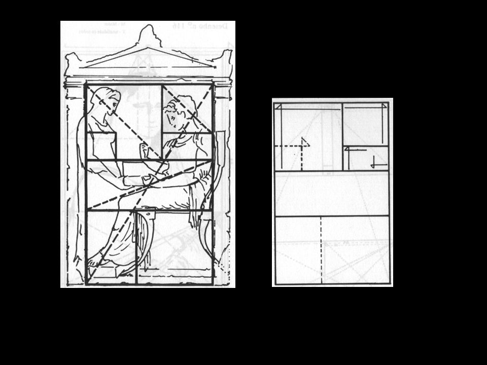
Formato Escolha do formato: esse é o primeiro problema de caráter artístico que se apresenta ao programador visual na elaboração de um trabalho gráfico. Cada tipo de publicação tem um formato adequado. Na escolha do formato influem fatores de praticidade e comodidade, além de fatores estéticos e de interpretação. Antes de tudo o formato deve ser prático. Inicialmente olha-se a finalidade utilitária do formato. Um livro, um folheto, um catálogo, um folder sugerem respectivamente as dimensões para as quais é conveniente orientar-se.Quando se diz que um formato é normal, entende-se que está nas dimensões que convencionalmente se julgam mais aptas para um trabalho determinado.

56
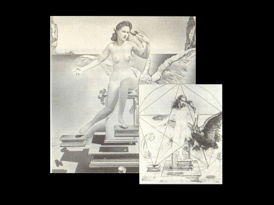
Proporção Áurea e Número Áureo
1: 1, 618 Para que um todo, dividido em partes desiguais, pareça harmonioso, é preciso que exista, entre a parte pequena e parte maior, a mesma relação que entre a grande e o todo.

57
D C AB = BC = CD = DA EC = EF DA = 1 AF = 1,618 A E B F

58
D C G A F E B

59
D C G e A F E B

60
D C G A B F E

61
D C G H I e A F E B

63
Partenon

64
AB’ é a seção áurea de AC’, que por sua vez é a seção áurea de AC
Figuras geométricas (en el pentagrama o estrella de cinco puntas AB' es la sección áurea de AC' que a su vez es la sección áurea de AC) AB’ é a seção áurea de AC’, que por sua vez é a seção áurea de AC
 AB’ é a seção áurea de AC’, que por sua vez é a seção áurea de AC.")
66
A proporção áurea na natureza

67
Bibliografia geral Wong, Wucius. Princípios de Forma e Desenho, Martins Fontes. Munari, Bruno. Design e comunicação visual Martins Fontes. Ostrower, Fayga. Universos da arte. Ed. Campus Ribeiro, Milton. Planejamento visual gráfico.Ed. Linha gráfica

Apresentações semelhantes


>")


